Super Sundays
- Role
- Brand identity and campaign design, LouderX
- Tools
- Photoshop, Illustrator
Building the brand
Super Sundays arrived as a name and nothing else. Every other night at LouderX was built for the Indian crowd; this one was aimed at a local Australian audience, so none of the usual shorthand worked. I led the creative on it and built what the room would see: the mark, the colour, the launch campaign, the website.
The wordmark
One mark, six completely different nights to sit on top of. Heavy, white, unchanged, so the artwork underneath is free to do anything.
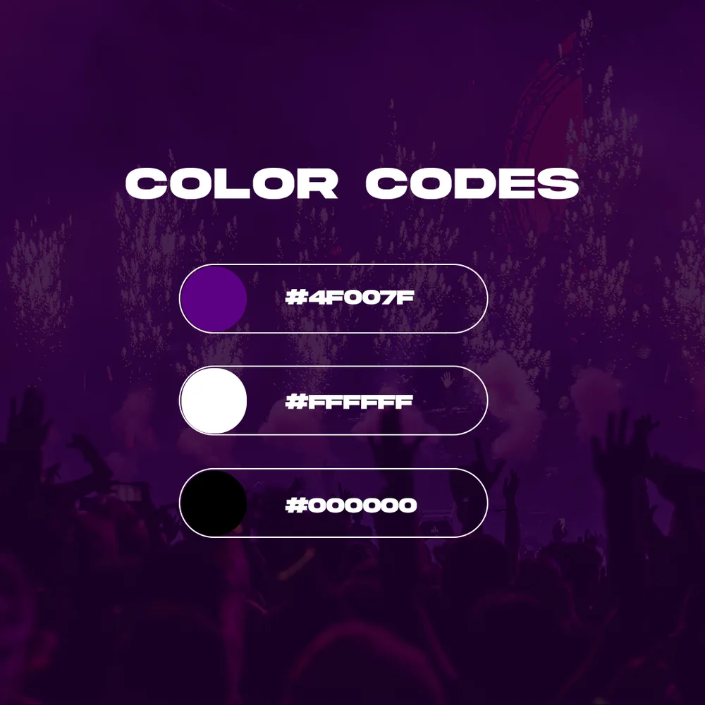
Colour codes
Purple is the colour a room turns once the lights go down. It glows on a phone screen, and it makes a Sunday look like an event.
The launch
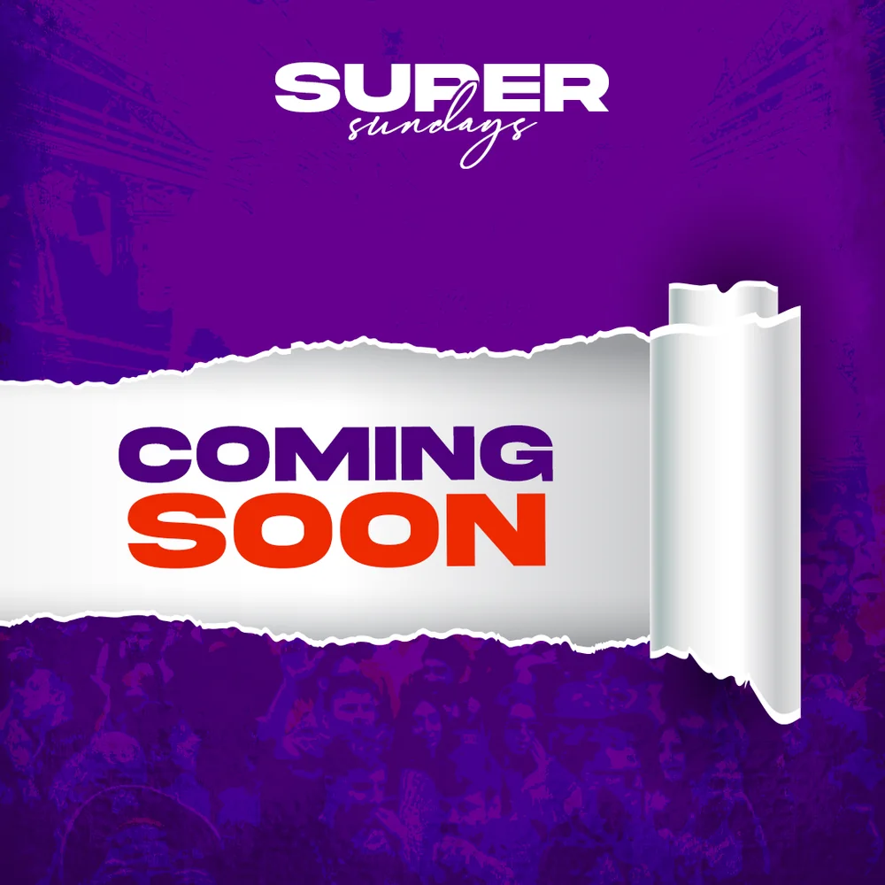
Launch teaser
Give away nothing, hint at everything. It went out before anyone knew what Super Sundays actually was, which was the point.
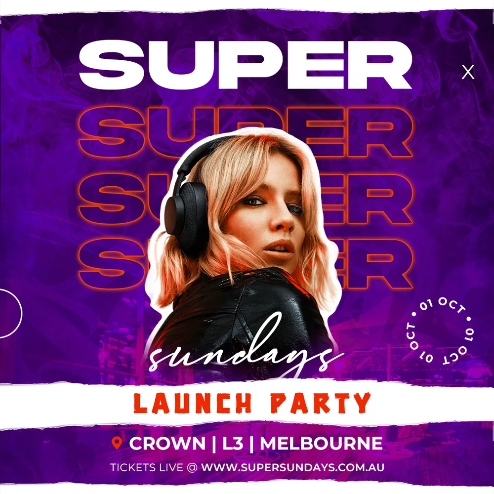
Launch Party
The very first Super Sundays, live on the site. The launch night poster, finishing the job the teaser started.
In the wild

The banner
The header puts you in the room before you have read a word. A Sunday that is very clearly not a quiet one.
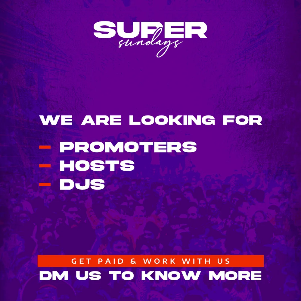
Hiring post
Even a hiring post follows the rules. Same purple, same mark, same voice, which is how a brand this new starts looking established.
The themes
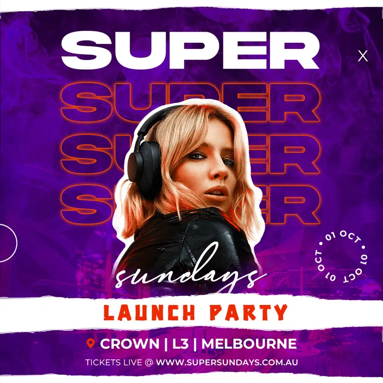
Launch Party
The opening night. Nothing existed yet, so this one had to say what Super Sundays even was before it could sell a ticket.
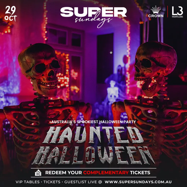
Haunted Halloween
Fancy dress, late October. Played it straight to horror rather than cute, because the room was going to be in full costume.
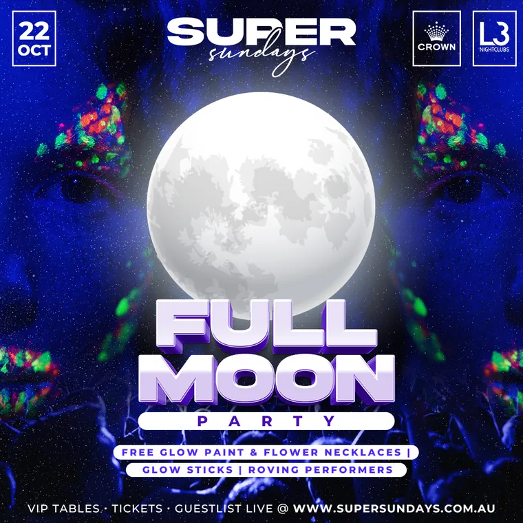
Full Moon
Glow paint, UV and a moon the size of the room. The full moon party, lifted off a beach and put on a dancefloor.
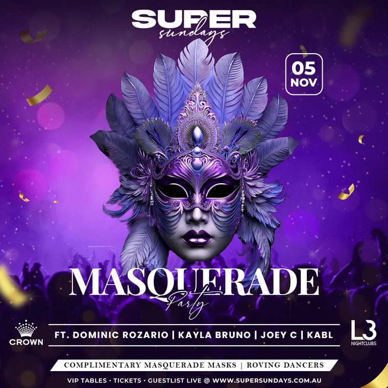
Masquerade
A mask says ball before the poster says anything. Elegant enough to dress up for, loose enough to actually enjoy.
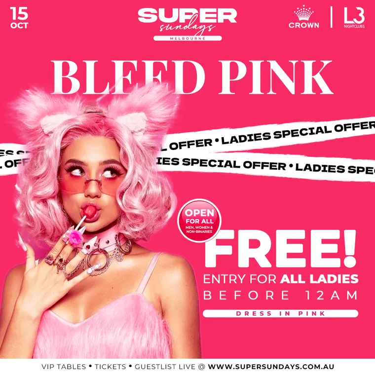
Bleed Pink
Bleed Pink was never going to be subtle. A night built for women, free entry for all of them, and pink pushed to the edge.
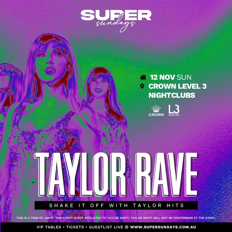
Taylor Rave
Every Taylor song, put through a rave. A tribute night where the hits were hers and the floor was entirely ours.
Why this one is different
Every other night I designed at LouderX was aimed at the Indian crowd. Super Sundays was not. It was a new vertical, opened at Crown Level 3 in Melbourne for the local Australian audience. I built its visual identity and led the creative vision across the whole concept.