HVAC Pivot
- Role
- E-commerce UI and UX
- Tools
- Figma, Photoshop
From first click to paid order
A tradesperson usually arrives holding a model number off a unit that has already failed, so every screen between them and a paid order is a chance to lose the sale. Six steps, each one earning the click to the next.
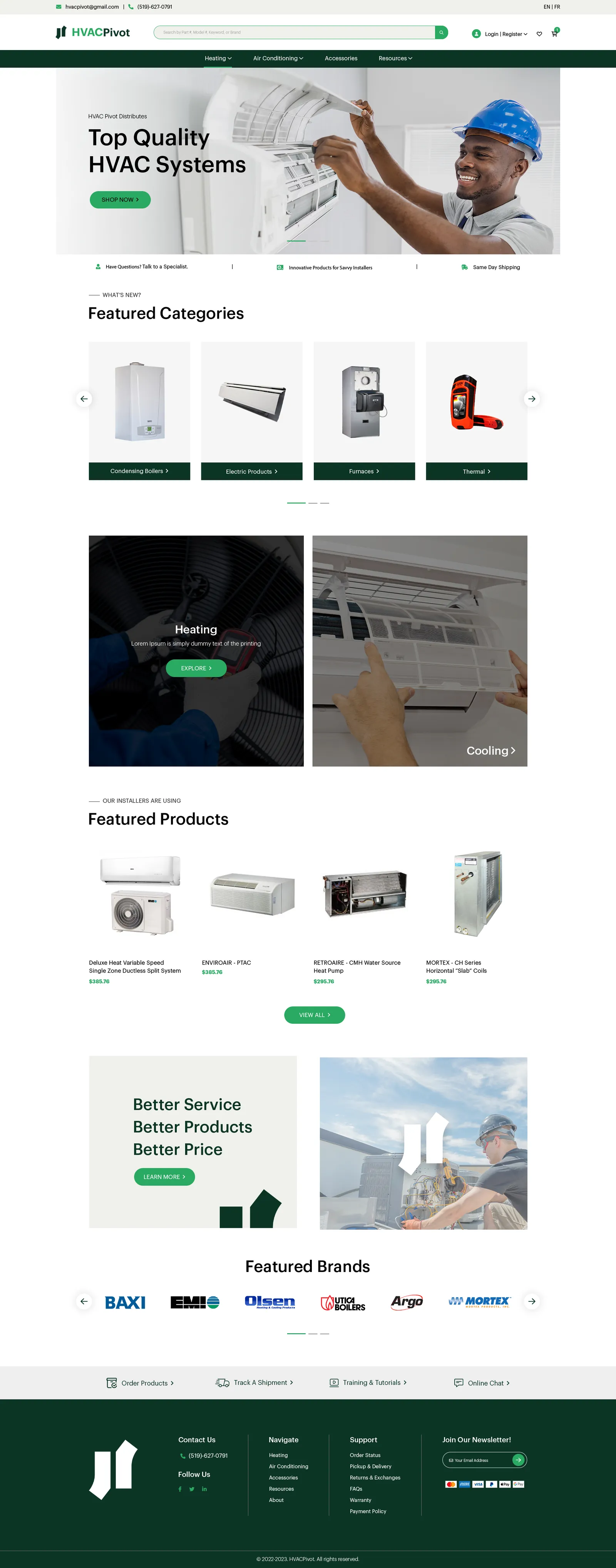
01Landing
Home
Straight into featured categories. Somebody arriving here usually knows roughly what they need.
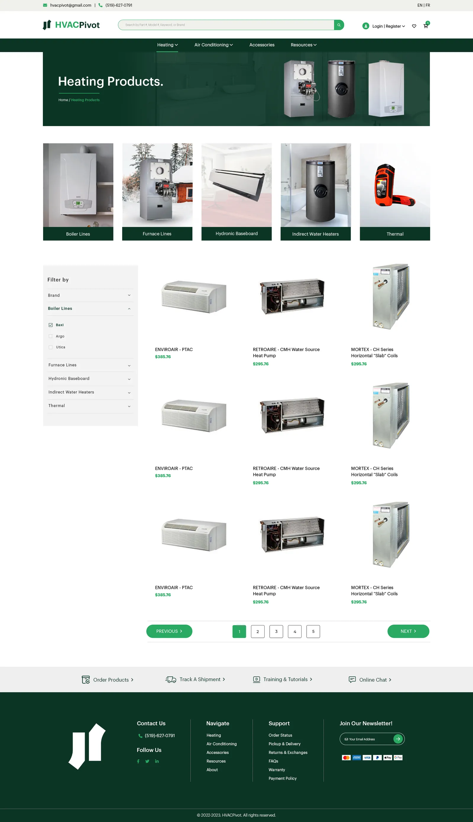
02Browse
Category
Heating Products. Filter rail on the left, faceted grid on the right, prices visible without a click.
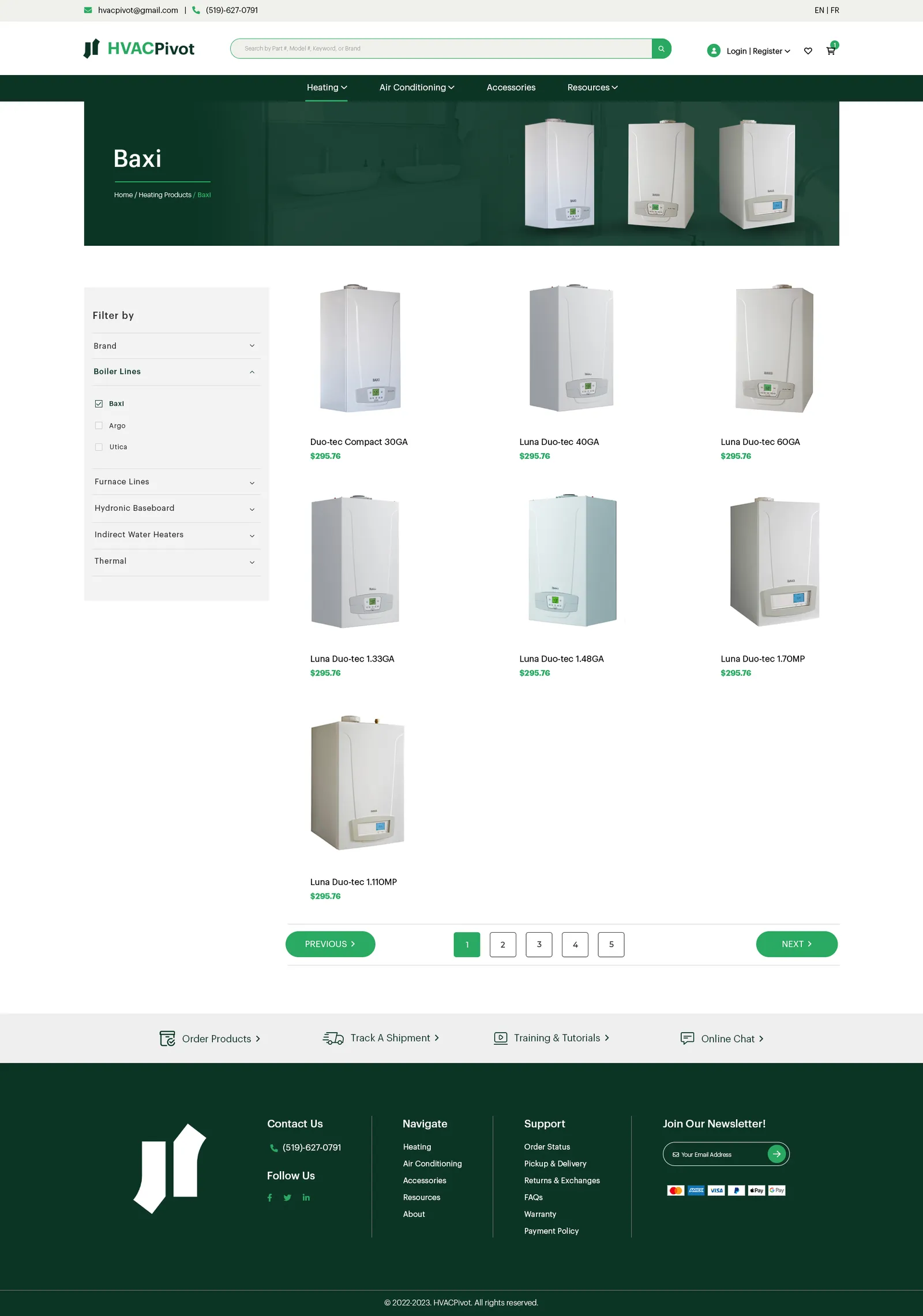
03Narrow
Sub-Category
Boiler lines, furnace lines, baseboard. The layer most commerce sites skip and then wonder why people bounce.
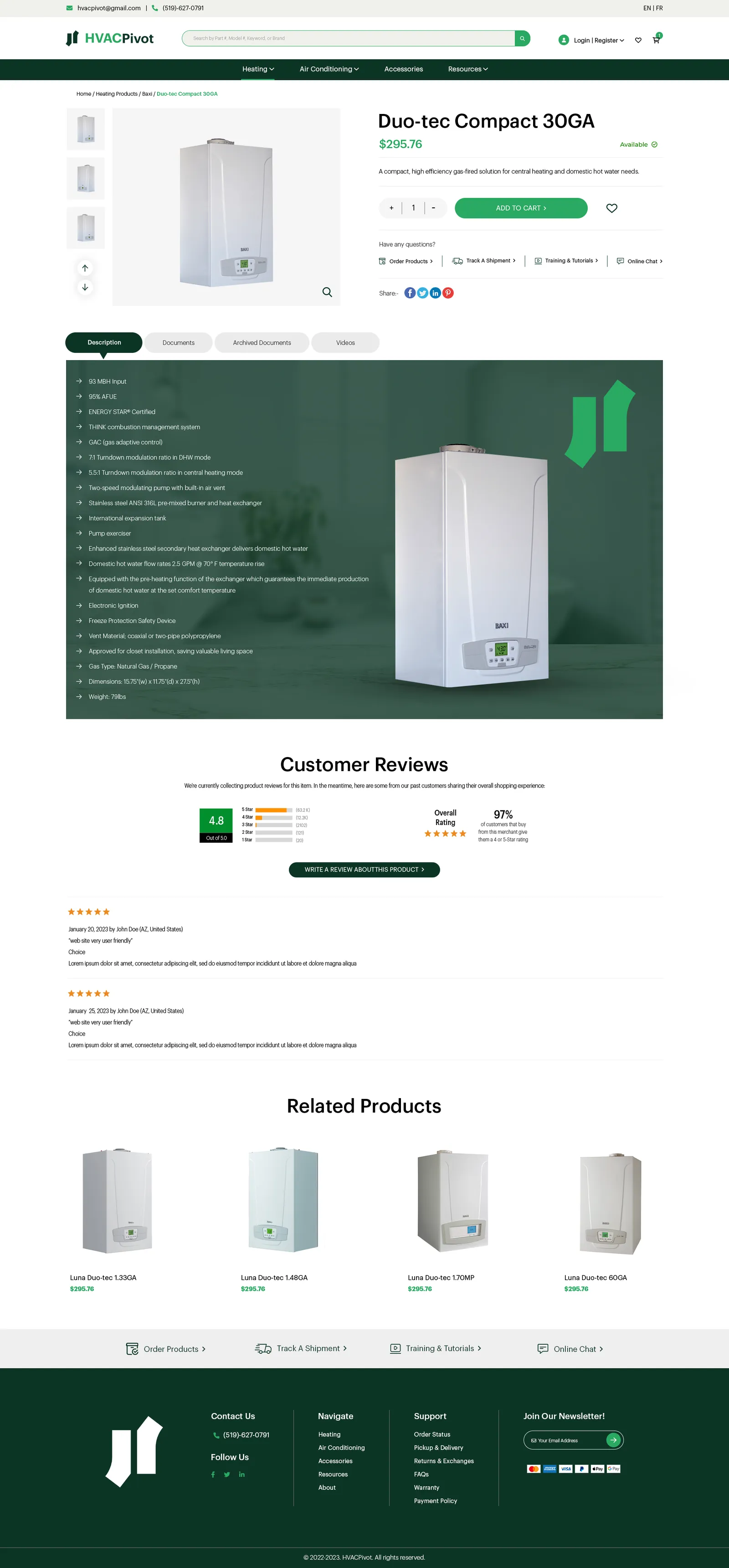
04Decide
Product
Gallery, price, quantity, add to cart, then tabs for description, documents and videos, a full spec list and reviews.
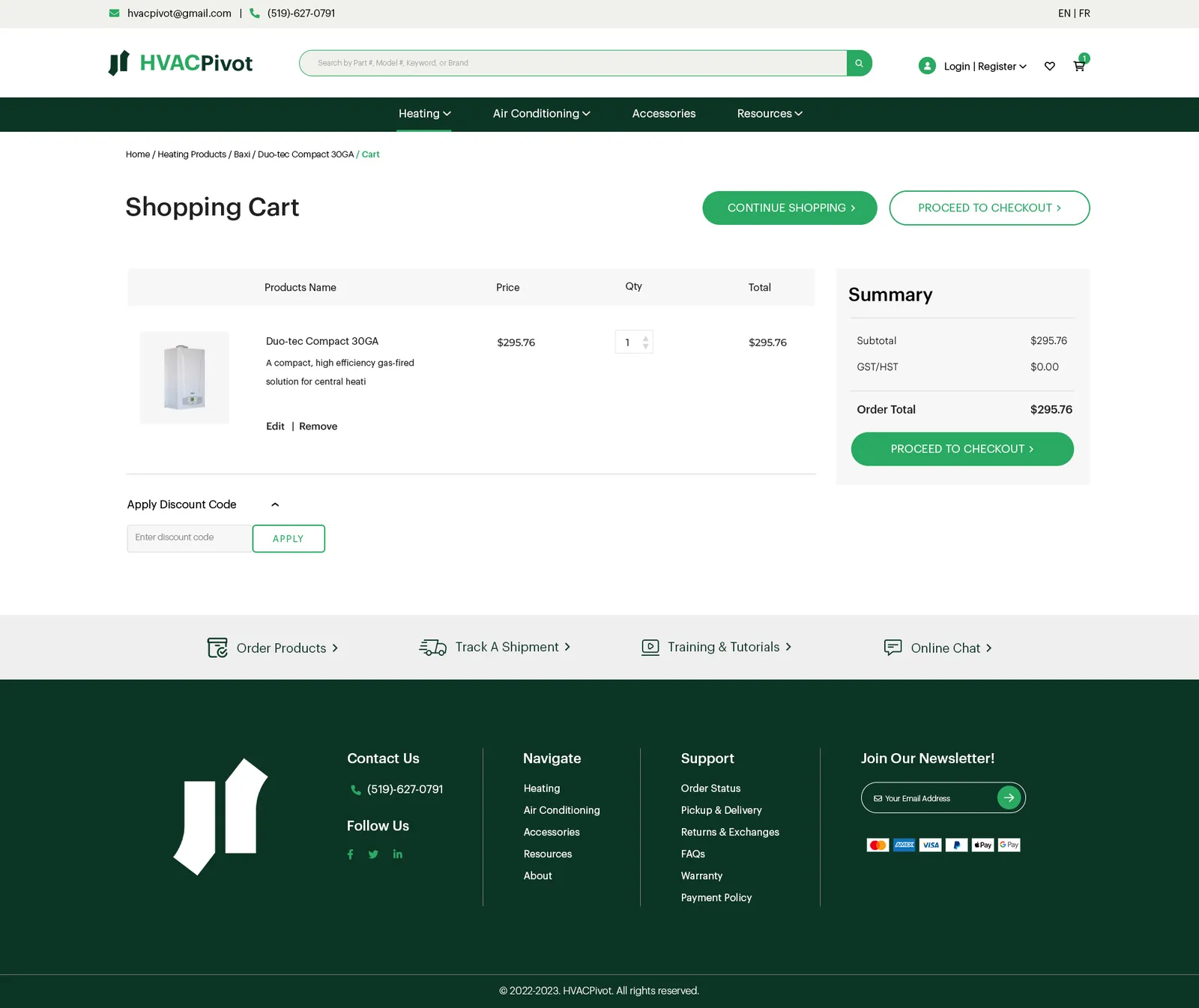
05Commit
Cart
Line items and totals, kept short so the next step is obvious.
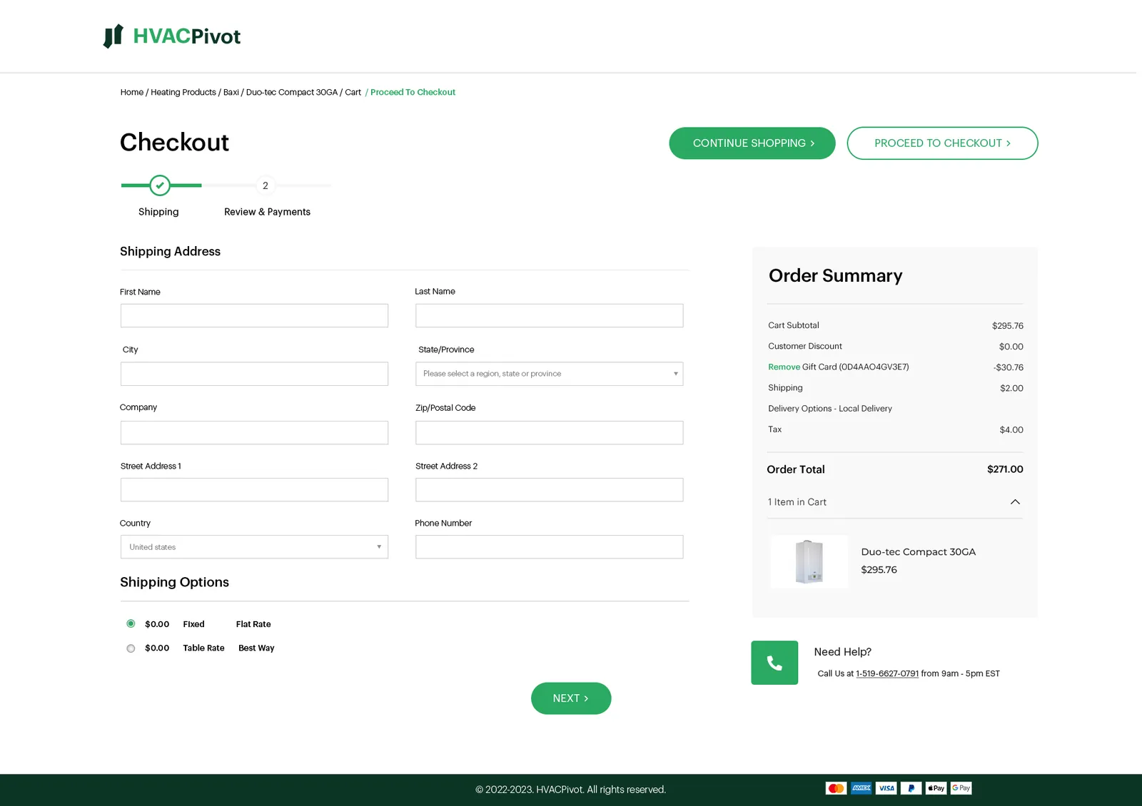
06Pay
Checkout
The last screen. Nothing on it that is not needed to complete an order.
The whole build
The whole set at full length, path screens included, at whatever pace you want to read them.
Scroll inside the screen
Home
Straight into featured categories. Somebody arriving here usually knows roughly what they need.
The brief
HVAC is not a browsing purchase. People arrive knowing roughly what they need, often holding a model number off a failing unit, and they want the right part and a way to pay for it. Everything here is built around shortening that.
A catalogue this size has a layer most commerce sites collapse: category, then sub-category, then product. Skip the middle one and a shopper lands in a grid of two hundred boilers with no way to narrow it. Keep it and every extra click has to earn itself. The product page then has to carry a gallery, price, quantity, specs, documents, videos and reviews without burying the add to cart button under all of it.
Where it landed
A path that runs from a landing page to a paid order without a dead end in it, with filters at the point they are needed and the specifications a trade buyer checks before committing sitting on the product page rather than inside a PDF. Built on Magento, by the same in-house development team.