Aero Black Limo
- Role
- Concept redesign, UX and UI, brand system
- Tools
- Figma, Photoshop, Rive
The brief
Aero Black Limo Services runs chauffeured airport transfers in the Greater Toronto Area, mostly to and from Toronto Pearson. Their live site was built in 2022 and still behaves like it: flat cards, stock blue, and a booking path that asks for everything up front. I rebuilt it as a 2026 product to see how far the experience could move without changing the business.
What was wrong
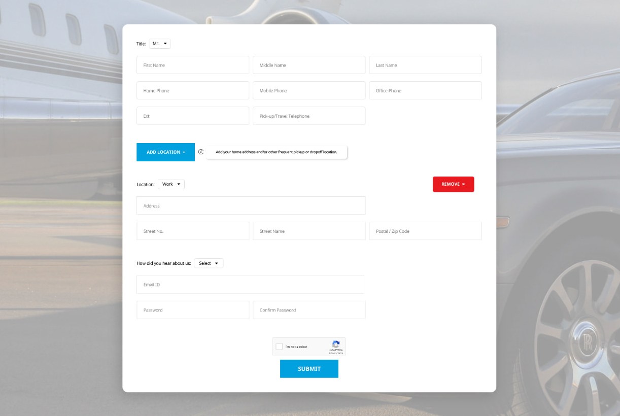
Booking an airport car should take a minute. On the current site it does not. You are asked to fill in more than twenty fields before you can register, all on one page, with nothing saved if you stop. The booking form wants a pickup time but has never heard of your flight, so when the flight is late you have to ring and rearrange it yourself. And once the car is on its way, there is no way to see where it is.
The live 2022 site
Registration as it stands today. Twenty-plus fields in one go, no steps, and nothing saved if you stop.
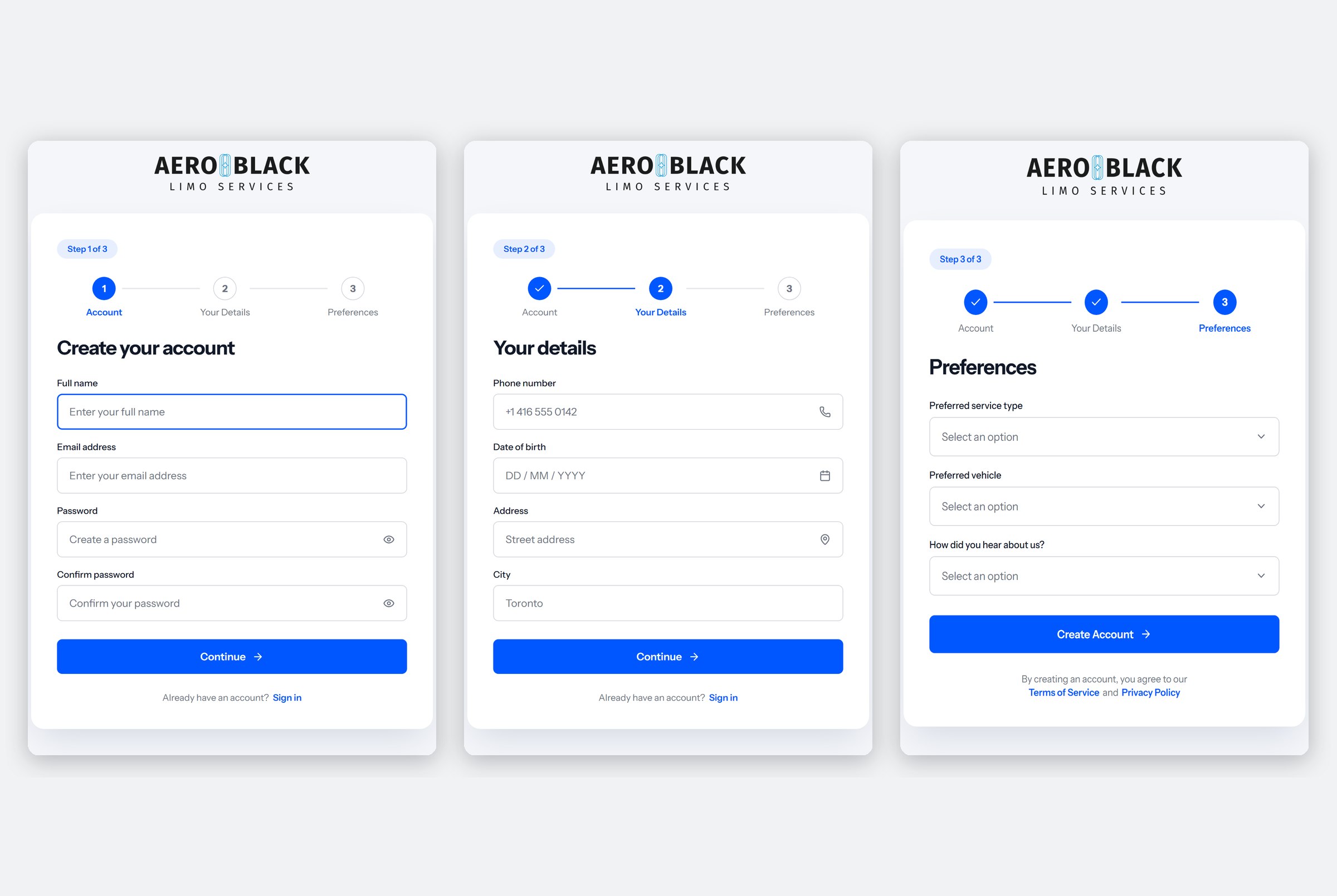
The 2026 rebuild
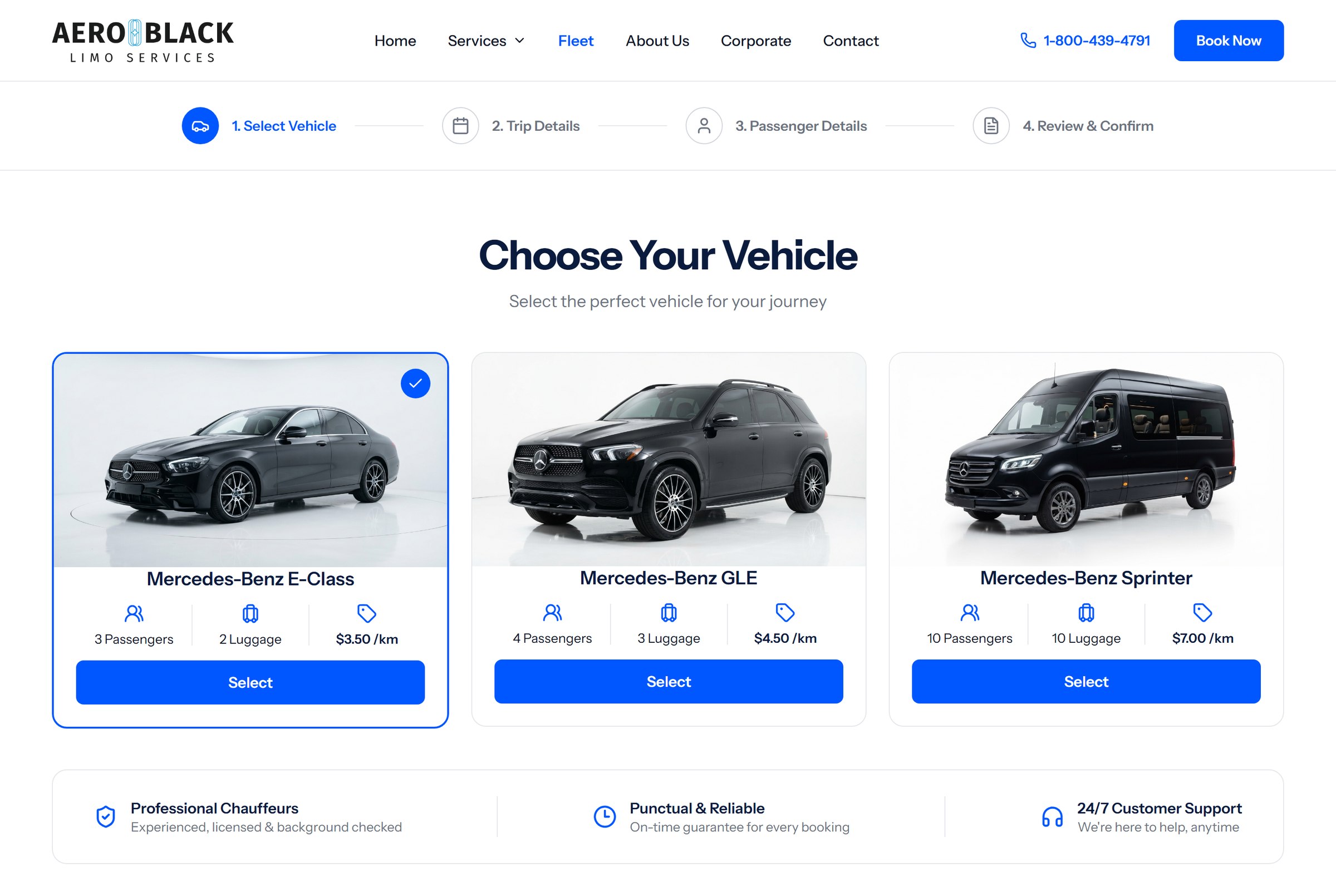
The same task in three steps of four fields, with progress saved between them, so it can be finished on a phone in an airport queue.
The 2026 rebuild
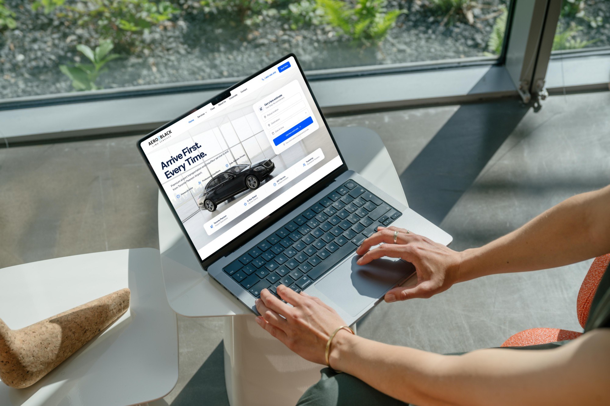
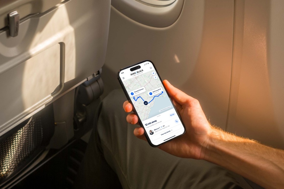
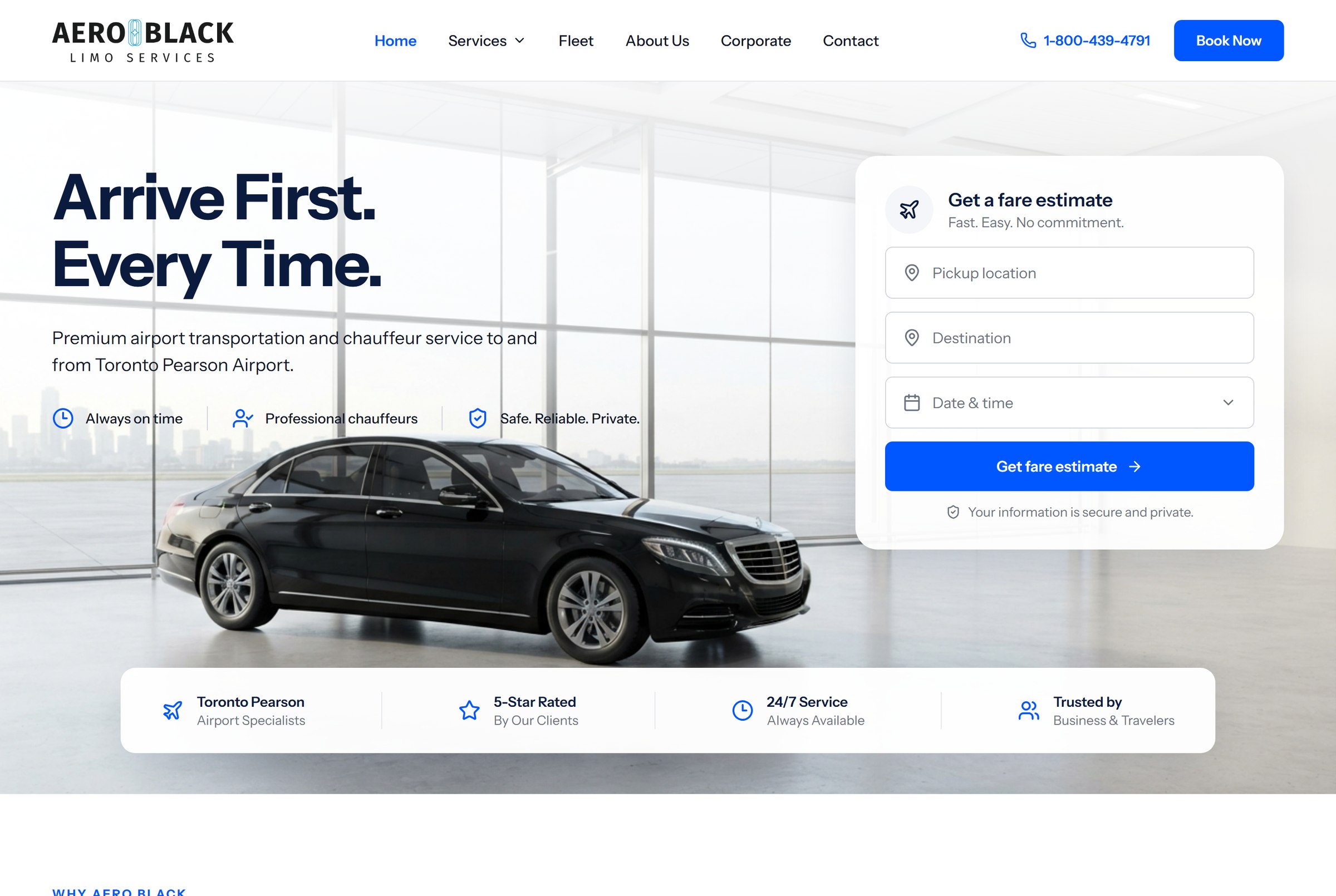
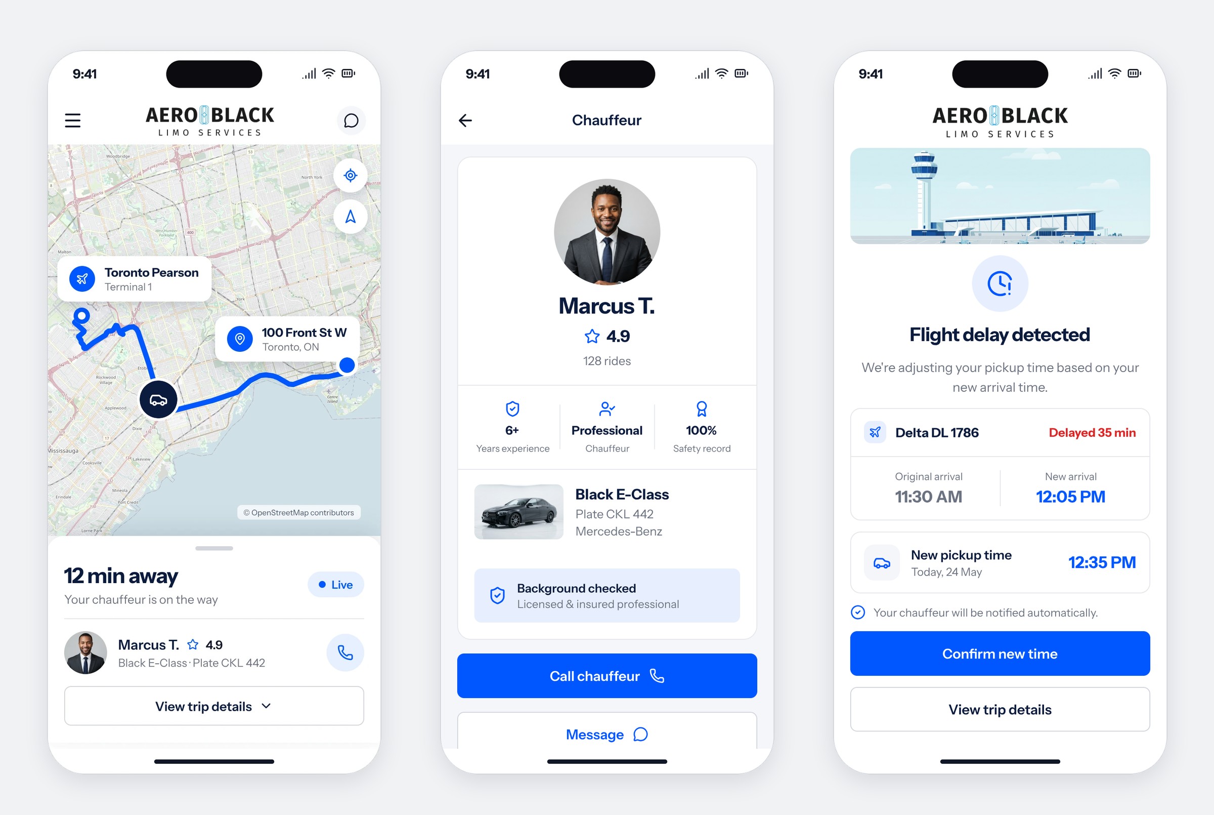
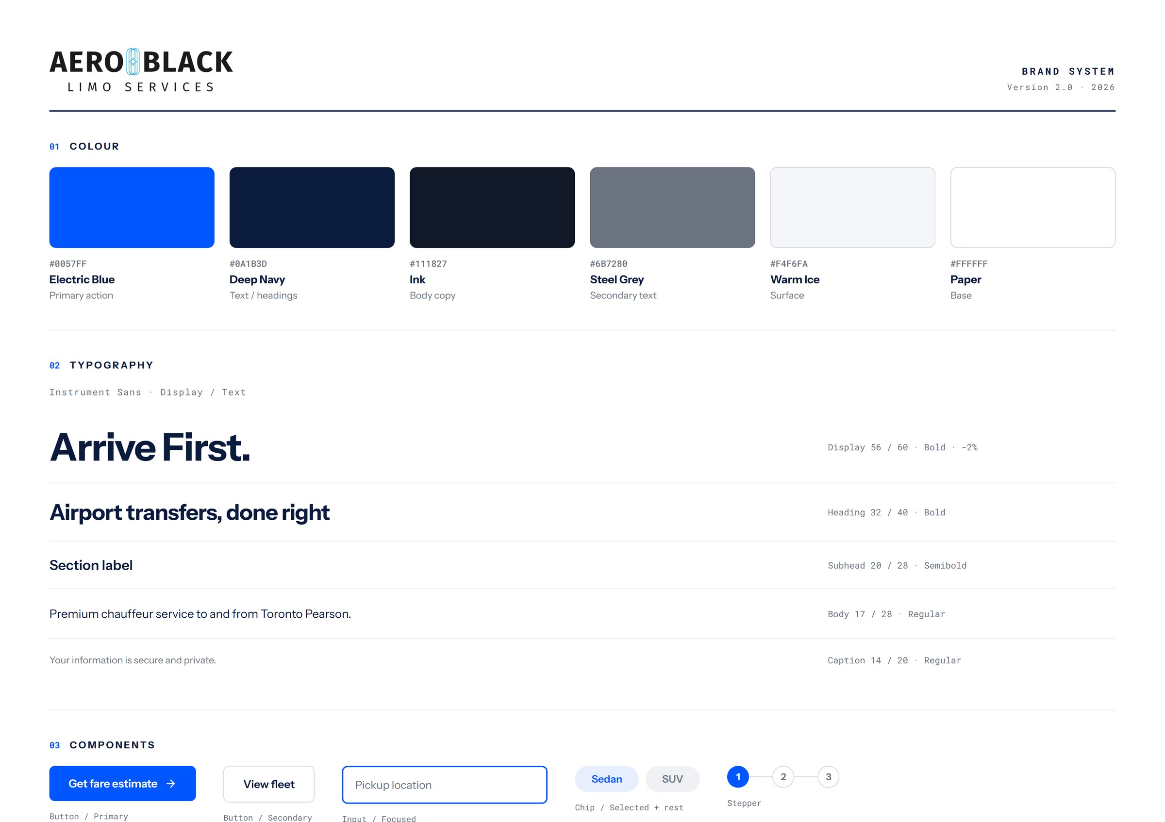
Desktop, mobile and the brand system behind them, in the order a traveller would meet them.
How it came together
- 01
Audit
Walked all eight pages of the live site and marked every point where the user has to do work the system could do for them.
- 02
Flight-aware booking
One flight number replaces four fields. Pickup time recalculates itself when the flight moves.
- 03
Registration, unpacked
Twenty-plus fields split into three steps of four, with progress saved between them.
- 04
Live ride
Real-time map, ETA, chauffeur profile and plate, so nobody stands at arrivals guessing.
- 05
Brand, modernised
The original cyan refined into a cleaner Electric Blue on Warm Ice, with a documented type scale and component set.
Where it landed
A concept that keeps every service the business actually sells and removes the friction around them. Booking drops from a form to a flight number, registration becomes finishable on a phone, and the brand reads as a 2026 product rather than a 2022 template.
20+ to 4
Fields per screen
3
Steps to register
1
Flight number to book
8
Pages reworked